art, clarity, and the craft of land brokerage
In commercial real estate, most logos look the same—for the simple reason that most brokerages work the same way. But I didn’t start this business to follow someone else’s formula. I started it because I love this industry—messy as it is. Because I believe land brokerage, when done right, is both an art and a discipline.
And because I’m not just building a business—I’m building something that reflects how I think, how I work, and what I value.
That’s where the logo came in.
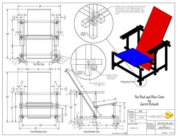
It’s inspired by the work of Piet Mondrian, the Dutch modernist who stripped away noise to get to the essence. His compositions were bold and minimal, yet deeply complex in thought. That spoke to me. Because that’s how I try to work: cutting through the clutter, simplifying complexity, and bringing focus to what really matters.
a logo as a mirror
For me, this isn’t just a design—it’s a distilled self-portrait. I’m an independent owner-operator, with no corporate structure behind me. Every deal, every analysis, every strategy comes from me. The logo had to reflect that kind of hands-on, thoughtful commitment. Not flash. Not polish. Just structure, balance, and purpose.
The clean lines reflect how I work—calm, deliberate, and structured. The form is rooted in architecture and grids, like the zoning maps and site plans I study every day. And within it, a hint of creativity: vibrant colours and overlapping layers that reflect the multi-dimensional nature of every site, every owner, every opportunity.
It’s not a house. It’s not a skyline. It’s a framework. And that’s intentional. Because my job isn’t to impress—it’s to reveal value others miss.
mondrian as a muse
Mondrian started his career painting landscapes—literal, representational, familiar. Over time, he stripped it all down to lines, angles, and colour. He wasn’t rejecting beauty—he was going deeper. That evolution reminds me of my own path.
I started in the same way most brokers do—focusing on surface-level problems. Over time, I found myself drawn to the more challenging questions: What’s this site really worth? What’s the hidden value? How can I help this owner get the most from what they have—without hype, without shortcuts?
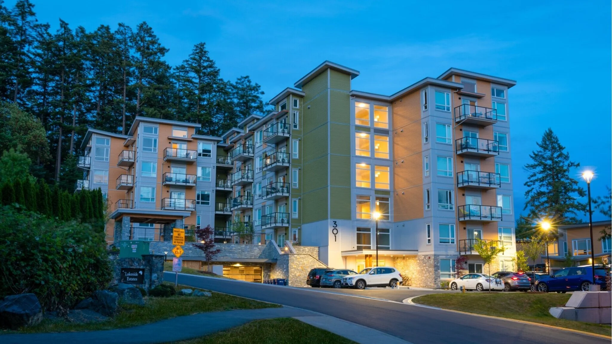
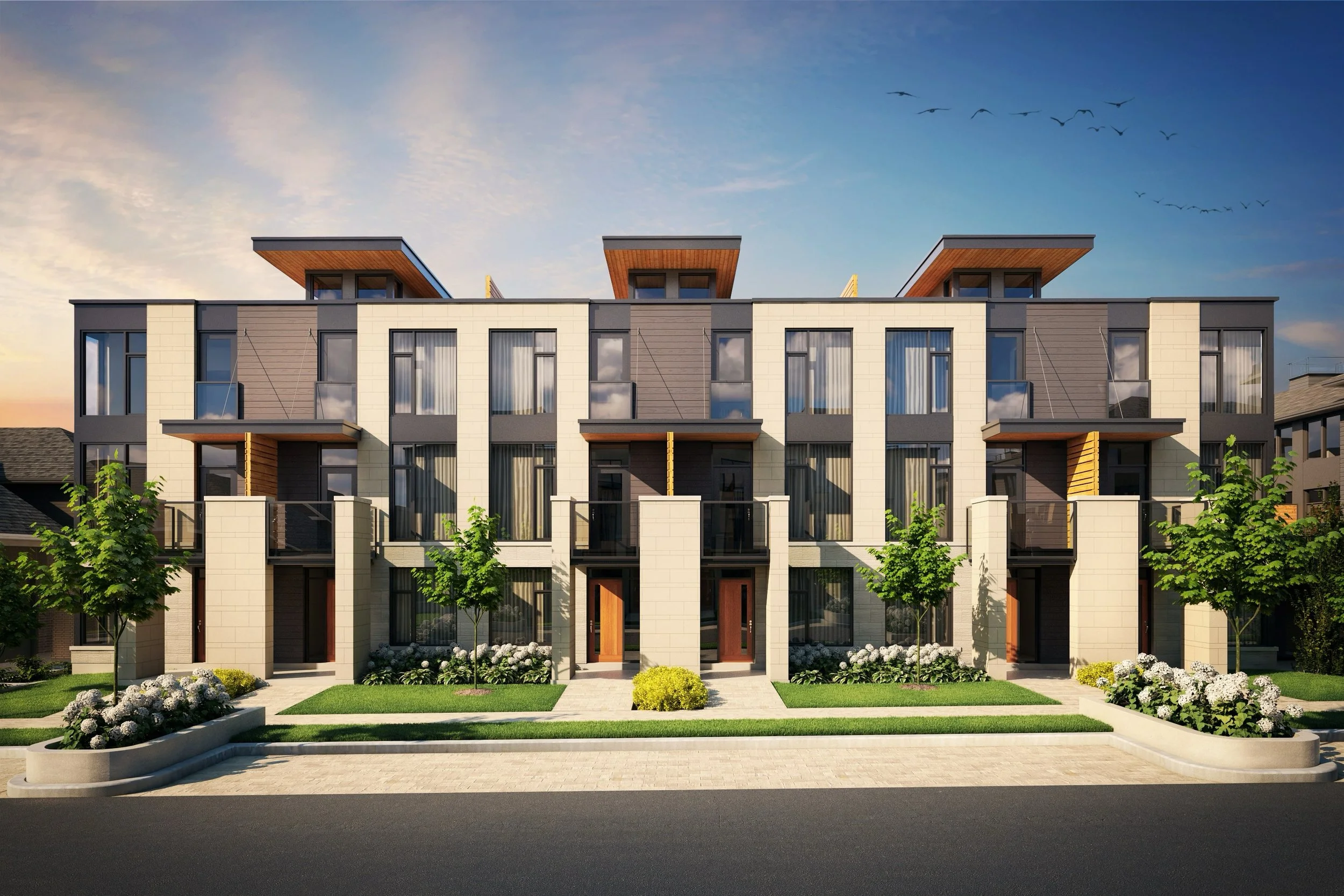
Urban land brokerage is now the heart of my work. It’s where every layer of the city converges: planning, economics, people, politics, long-term vision. To do it well requires precision and patience, but also imagination. Like Mondrian, I try to see the structure beneath the noise—and then bring it to life with clarity and intent.
design that stands the test of time
Mondrian’s timeless style continues to shape architecture, industrial, graphic, and interior design today.
what the lines mean
The horizontal and vertical lines in the logo aren’t just for show. They reflect the literal and metaphorical grids I work in: city streets, property lines, zoning overlays, and financial models. They also represent the invisible alignments I help create—between buyers and sellers, owners and developers, policy and potential.
There’s a reason the lines don’t quite form a box. This work is never that neat. A good land deal isn’t about forcing a fit—it’s about creating space for something new to take shape. That’s what I try to do: give structure to possibility.
bold, structured, intentional
design
more than marketing
Some people design a logo to stand out. I designed mine to mean something. To remind myself why I do this, and how I want to show up in this work: with discipline, creativity, and care.
Because I genuinely love what I do. I love the strategy. I love the complexity. I even love the chaos sometimes. There’s beauty in it. Not always on the surface, but underneath—waiting to be revealed.
an invitation
If you’re the kind of person who’s more interested in substance than bling—if you value thoughtfulness, independence, and creative problem solving—I think we’ll work well together.
Because I’m not here to close fast deals or push quick flips. I’m here to help people make smart decisions about the land they own, and what’s possible on it.
That’s what this logo means to me. It’s not branding. It’s the blueprint for how I work.
more about this topic


Current Opportunities